Mount Shasta, April 2019 — Today on the Book of Faces, somebody asked, “Book suggestions for better copywriting?”
And while I’ve found many great copywriting books over the years, I would always start with one about headlines. And even today, the classic “Tested Advertising Methods” by John Caples is still the best I’ve seen for headlines. And the reason that’s important is that if the headline doesn’t hook their interest, then nothing else matters.
- Grab their eyes. (Because if you don’t, nothing later matters.)
- Hook their interest. (Because if you don’t, nothing later matters.)
- Tell them what to do. (Because if you don’t, they’ll do nothing.)

An Advertising Case Study
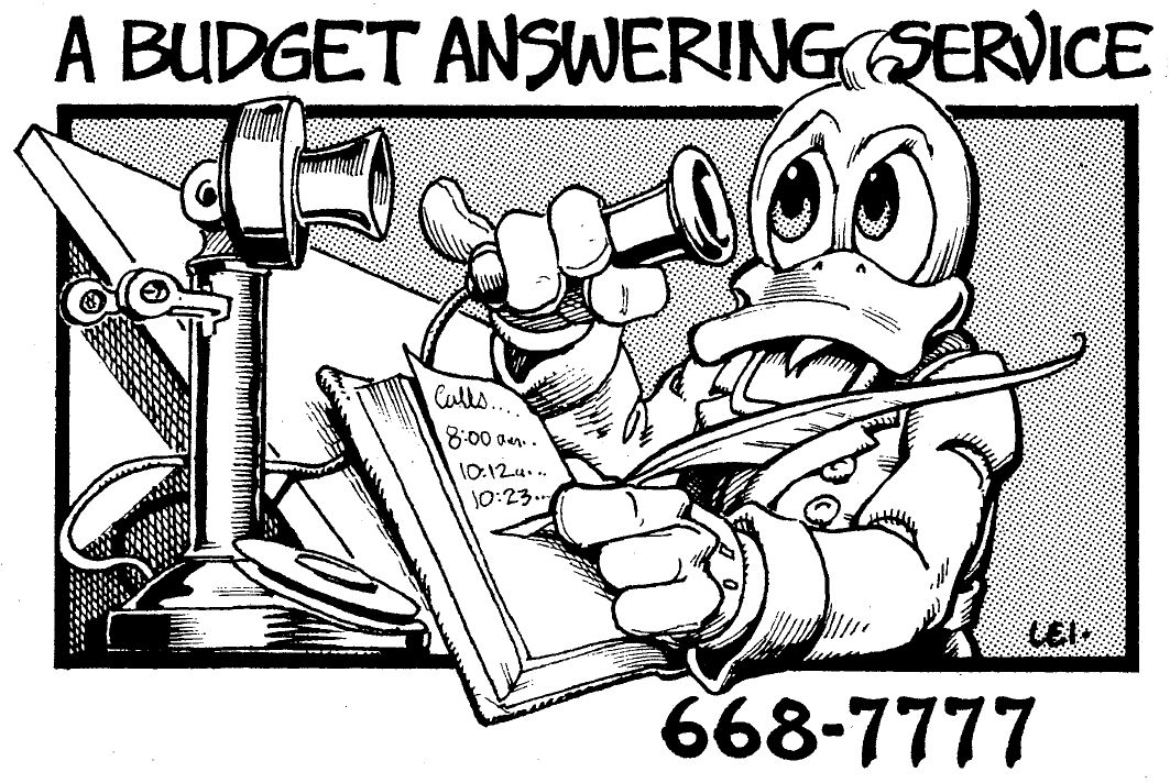
- On posters, where it took up the top 2/3 of the page. (The bottom of the poster was folded up, and stapled so as to hold yellow “Take One” cards like business cards, and which displayed the same graphic, with our price on lower left side.)
. - In the yellow pages, exactly as you see it here, using the smallest size of display ad. Even when other ads were much, much larger, when you opened the yellow pages up, the FIRST thing you saw was this ad. And as you can see, the picture uses 80% of the available space … because you must grab their eyes first.
. - In the local weekly entertainment newspaper as a display ad.
Adding Sales Points to the Poster Formula
As you’ve seen, in many kinds of advertising, additional sales points are made. For example, in an online “long-form sales page,” a good copywriter might add a back-story, bullet-points about “what you will get” phrased to whet your curiosity, perhaps some “social proof” with testimonials, often a money-back guarantee, a post-script summary at the bottom, and one or more”buttons” as a call to action. (“Click Here to get Fido Dogwash at 30% Off!”)
But in some internet advertising, there might be very little more. For example, a video “squeeze page,” whose purpose is to get you to give up your email address in return for some promised “freebie.” The squeeze page may work with nothing but 1) a headline or the video graphic to grab your eyes; 2) the video quick-pitch to hook your interest; and 3) a button below saying “Click Here” which tells you what to do.
Applies to ALL Forms of Advertising?
- Facebook Ads — graphic to grab your eyes and stop you scrolling down the page, block of text to hook your interest, and a little button to tell you what to do next: “Learn More!”
- Banner and Display advertising on various websites — Grab your eyes, hook your interest, tell you what to do.
- Search Engine Ads — your eyes are already on the page, so now the competition switches to whose adwords advert can best hook your interest, then the link is what you’re supposed to do next
- Magazine and Newspaper print display ads
- Advertising specialties — for example, companies that give out calendars with 1) picture, 2) what they do; 3) phone number
- Television adverts on cable, Hulu, and Network broadcasting — They’ve already got your eyes and the moving pix they show now transition into hooking your interest, and at the end you know what to do, right?
- Direct mail — Like ValPak with many “coupon” sized adverts, and each one has the Poster Formula. Or those “every door” direct mail folding brochures from burger places that catch your eyes, hook your interest with discount deals, and urge you to rush to their nearest location to scarf down burgers. Or even a direct mail letter — rarely used these days, but they work GREAT for me and my clients — because if you do it right so the right person actually opens the envelope to read the letter, then you have grabbed the eyes, and you quickly hook their interest, and after piling it on a bit, tell them what to do next, which is probably to call you right this minute!
There are hundreds more examples, and perhaps there are a few exceptions somewhere, but the point is this —
Is the Poster Formula a 3-Minute Advertising Course?
Maybe so. Because if you simply master the Poster Formula, and practice so you know how to apply it, you’re well on your way to creating ads that work, and work, and work, and work.
Happy advertising, and happy hunting!
